Amazon Mobile Optimization: 80% of Traffic Sees Only This
 Built by zonfy in 90 seconds
↑ Real output. Try it free →
Table of contents
The Mobile Reality of Amazon Shopping
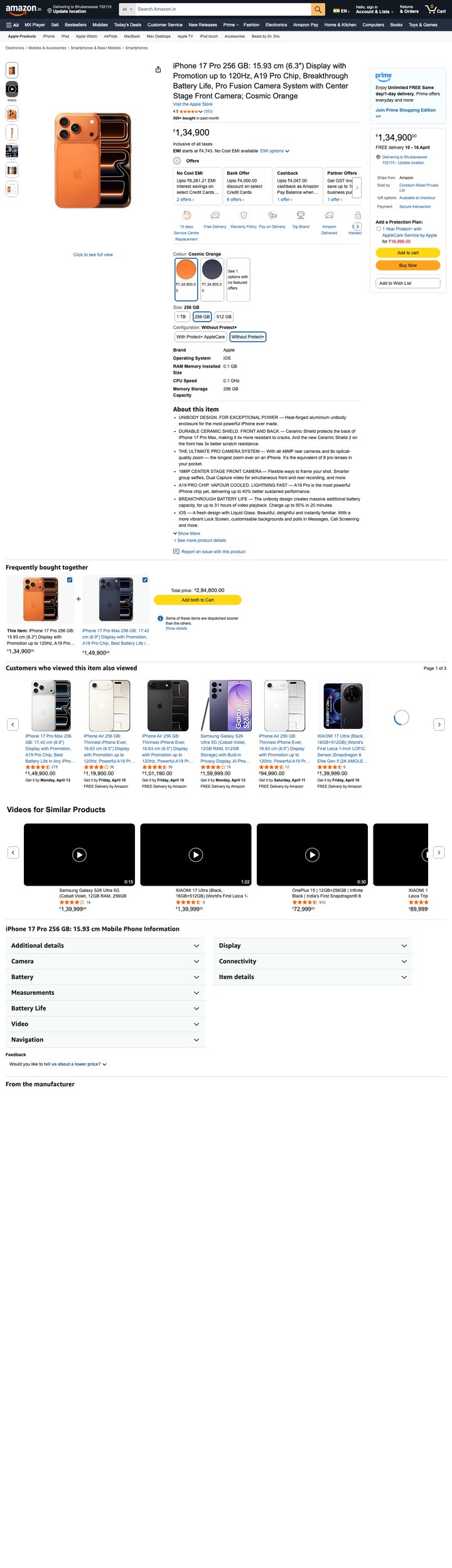
Here is a number that should reshape how you think about your Amazon listing: 70-80% of all Amazon traffic now comes from mobile devices. Not desktop. Not tablet. Phones.
This is not a recent shift. Mobile traffic has been the majority since 2019, and it has only grown. In 2026, the Amazon Shopping app is the third most-used retail app globally, and the mobile web experience accounts for another significant chunk of traffic.
Yet most sellers still build and optimize their listings on a desktop monitor. They review their images at full resolution on a 27-inch screen. They read their full title and all five bullet points in the comfortable desktop layout. They preview their A+ Content on a widescreen browser window.
The problem is that their customers are seeing something completely different. On a 6-inch phone screen, Amazon truncates, collapses, and reformats nearly every element of your listing. If you are not optimizing for mobile first, you are optimizing for 20% of your audience and leaving the other 80% to chance.
What Mobile Shoppers Actually See
Search Results Page (Mobile)
When a customer searches on the Amazon mobile app, each result displays:
- Product image: Approximately 300x300 pixel thumbnail
- Title: First 75-80 characters (the rest is cut off with an ellipsis)
- Star rating and review count: Displayed as stars + number
- Price: Current price and any discount indicators
- Prime badge: If applicable
- Best Seller / Amazon's Choice badge: If applicable
- Delivery date estimate: Estimated arrival
That is it. Your entire listing is represented by a thumbnail, a partial title, a star rating, and a price. The customer makes their click/skip decision based on these elements alone.
Product Detail Page (Mobile)
Once a customer taps on your listing, the mobile product page shows:
Above the fold (visible without scrolling):
- Main image (swipeable gallery)
- Title (usually first 100-120 characters visible, collapsible)
- Star rating, review count
- Price and deal badges
- Buy Box information (Prime delivery, availability)
First scroll section:
- Variant selector (color, size, etc.)
- Bullet points (first 2-3 visible, with "Read more" expansion)
- "About this item" section header
Deep scroll sections:
- A+ Content (full rendering but sequential, not side-by-side)
- Customer reviews
- Related products
- Customer questions
The critical insight is that most mobile shoppers never scroll past the first 2-3 screens. Your main image, title, star rating, price, and first 2-3 bullets are all that 60-70% of your mobile visitors will ever see.
Mobile Title Optimization
The 80-Character Rule
On mobile search results, Amazon truncates titles at approximately 75-80 characters. Anything beyond that is invisible until the customer clicks into your listing. This means the first 80 characters of your title must:
- Include your primary keyword — the search term that drives the most traffic
- Communicate the product's core value proposition — what it is and why it matters
- Differentiate from competitors — what makes your product the one to click on
- Be readable — not just keyword-stuffed but actually compelling to a human
Title Structure for Mobile
Recommended structure for the first 80 characters:
Brand Name + Primary Keyword + Key Differentiator + Size/Quantity
Example — Desktop-first title (200 characters):
"PureGrip Premium Yoga Mat - 72x24 Inch Extra Thick 6mm Non-Slip Exercise Mat for Home Gym Workout Pilates Stretching Floor Exercises with Carrying Strap - Eco-Friendly TPE Material, Purple"
Mobile display (first 80 characters):
"PureGrip Premium Yoga Mat - 72x24 Inch Extra Thick 6mm Non-Slip Exercise Mat..."
This is effective because the primary keyword (yoga mat), key differentiator (extra thick 6mm, non-slip), and size (72x24) are all visible within the mobile truncation window.
Bad example:
"PureGrip - The Ultimate Premium Professional-Grade High-Quality Eco-Friendly Non-Toxic TPE Material Yoga Mat for Beginners and Advanced Practitioners"
Mobile display:
"PureGrip - The Ultimate Premium Professional-Grade High-Quality Eco-Friendly..."
The customer sees nothing useful — no product type clarity, no dimensions, no differentiators.
Testing Your Mobile Title
Before publishing any title change, test it:
- Count the characters of your proposed title
- Copy the first 80 characters and read them in isolation
- Ask: Does this substring tell the customer what the product is, why they should click, and how it differs from competitors?
- Check the Amazon app on your phone to see the actual rendering (character count varies slightly by device)
Try zonfy free
Generate Amazon listings in 90 seconds
Title, 5 bullets, description, backend keywords, and 7 gallery images — generated in 90 seconds. Drop straight into Seller Central.
Generate Full Listing →Your first generation is free. No credit card required.
Designing Images for Mobile
Main Image: The 300x300 Thumbnail Test
Your main image needs to be optimized for a 300x300 pixel display size. This is the thumbnail that appears in search results, and it is the single biggest factor in your mobile click-through rate.
The thumbnail test:
- Open your main image on your phone
- Pinch to zoom out until it is approximately 1 inch x 1 inch on your screen
- Can you immediately identify what the product is?
- Can you see key details (texture, quality, features)?
- Does the product fill 85%+ of the frame?
If you cannot clearly identify the product at thumbnail size, your main image is losing you clicks.
Mobile-optimized main image principles:
- Fill the frame. The product should occupy 85-90% of the image area. Tiny products with excessive white space disappear at thumbnail size.
- Simple angles. The standard 3/4 angle that shows depth and dimension works best. Avoid flat lay or extreme angles that obscure the product shape.
- High contrast. The product should have clear edges against the white background. Light-colored products may benefit from subtle shadow to define boundaries.
- Remove visual noise. No props, no text, no badges, no multi-packs shown. Just the product, clearly and prominently displayed.
- Zoom-level detail. While the thumbnail is small, customers can zoom by tapping. Ensure your image is high resolution (2000x2000px minimum) so zoom reveals quality and detail.
Gallery Images: Mobile Swipe Behavior
On mobile, customers swipe through your image gallery horizontally. The average mobile shopper views 3-5 images before making a decision. This means your image sequence matters:
Optimal mobile image sequence:
- Main image: Clean product on white background
- Key feature callout: Infographic-style image highlighting 3-4 top features with text overlays
- Lifestyle/in-use image: Product being used in its intended context
- Size/scale reference: Product next to a common object for scale, or dimensions overlaid
- What's included: All components laid out (especially if multiple parts)
- Comparison/differentiation: Why your product vs. competitors
- Guarantee/trust: Warranty information, certifications, satisfaction guarantee
Mobile-specific image design rules:
- Text size minimum: Any text overlay on images should be at least 24pt equivalent. Text that is readable on desktop at 16pt becomes illegible on mobile.
- Icon size: Feature icons should be at least 60x60px to be visible on phone screens.
- Layout: Use vertical layouts (tall images) rather than horizontal layouts. Mobile displays are portrait-oriented, and vertical images use the screen space more effectively.
- Image count: Upload all 7 allowed images plus the video slot. Mobile shoppers rely heavily on images since they are less likely to read text.
Bullet Point Optimization for Mobile
The First Two Bullets Are Everything
On mobile, Amazon typically shows only the first 2-3 bullet points before collapsing the rest behind a "Read more" link. Only 30-40% of mobile shoppers tap "Read more." This means your first two bullet points carry 60-70% of your bullet point's total persuasive weight.
First bullet strategy: Lead with your product's primary benefit and most compelling differentiator. This is not the place for generic statements. Be specific and customer-focused.
- Weak first bullet: "HIGH QUALITY MATERIAL - Made with premium materials for lasting durability"
- Strong first bullet: "6MM EXTRA-THICK CUSHIONING - Protects your knees and joints during yoga, Pilates, and floor exercises. 2x thicker than standard mats for noticeable comfort on hard floors"
Second bullet strategy: Address the second most common purchase concern or buying criterion for your category. For fitness products, this might be grip/safety. For kitchen products, it might be size/capacity. For electronics, it might be compatibility.
Mobile Bullet Formatting
- Keep bullets under 200 characters for mobile readability. Long bullets that wrap to 4-5 lines on mobile are visually overwhelming.
- CAPS for the lead phrase (Amazon convention) helps with scannability on small screens.
- Front-load the benefit. The first 15-20 words of each bullet should deliver the core message, because mobile truncation may hide the rest.
- One benefit per bullet. Do not cram multiple features into one bullet. Mobile shoppers scan, they do not read dense text blocks.
A+ Content Mobile Rendering
How A+ Content Changes on Mobile
A+ Content that looks stunning on desktop can look completely different on mobile. Key differences:
Side-by-side layouts become stacked. Modules that display two or three images in a row on desktop stack vertically on mobile. This means your carefully designed left-right comparison becomes a top-bottom scroll, and the visual relationship between elements changes.
Text length impact doubles. A paragraph that takes up a comfortable 3 lines on desktop can take 8-10 lines on mobile. Long text blocks become walls of text that mobile shoppers will scroll past.
Image aspect ratios matter more. Horizontal banner images that look impressive on desktop become narrow strips on mobile. The ideal A+ Content images have aspect ratios that work at both full width and mobile width.
Mobile-First A+ Content Design
- Use the Standard Image module (970x600px) as your primary module. It renders well on both desktop and mobile, and the horizontal aspect ratio maintains enough height on mobile to be visually impactful.
- Limit text to 3-4 sentences per module. If it reads as a wall of text on mobile, cut it in half.
- Test the mobile rendering. Before publishing, preview your A+ Content on a phone. Amazon provides a mobile preview in the A+ Content Manager, but nothing beats checking on an actual device.
- Use images with embedded text for key messages. Text baked into images maintains its size and layout regardless of device, while HTML text reflowed for mobile can look dramatically different.
- Comparison tables: These render reasonably well on mobile, but limit columns to 3-4 products. A 6-column comparison table becomes nearly unreadable on a phone screen.
Mobile CTR and Conversion Benchmarks
Mobile vs. Desktop Performance
Understanding the typical performance gap helps you set realistic expectations:
| Metric | Desktop Average | Mobile Average | Gap |
|---|---|---|---|
| Click-through rate | 2.5-4.0% | 3.0-5.5% | Mobile +15-25% |
| Conversion rate | 12-18% | 8-13% | Mobile -25-35% |
| Pages viewed per session | 8-12 | 4-7 | Mobile -40-50% |
| Time on listing | 90-180 seconds | 45-90 seconds | Mobile -45-55% |
The mobile paradox: higher CTR but lower conversion. Mobile shoppers click more freely (browsing behavior) but convert less readily (purchase friction, smaller screen, less information consumption). This means your mobile listing needs to work harder to convert the traffic it receives.
Mobile-Specific Conversion Optimization
Speed to value proposition. Mobile shoppers spend 45-90 seconds on your listing versus 90-180 seconds on desktop. Your value proposition needs to land in the first 10-15 seconds — through your main image, title, and first visible bullet.
Trust signals above the fold. Badges (Best Seller, Amazon's Choice), star rating, review count, and Prime eligibility should all be strong because mobile shoppers rely on these signals more heavily than desktop shoppers who will scroll through detailed content.
Price perception. Mobile displays make price comparison easier (shoppers swipe between search results quickly). Ensure your pricing is competitive and any discounts are clearly displayed.
One-tap purchase flow. The "Buy Now" button on mobile is prominent and accessible. Reducing friction (Prime eligibility, in-stock status, fast delivery) directly impacts mobile conversion.
Testing Your Listing on Mobile
The Mobile Audit Checklist
Run through this checklist for every listing, every quarter:
Search results appearance:
- Open the Amazon app and search your primary keyword
- Find your listing in the results
- Can you identify your product from the thumbnail?
- Is your title compelling in the first 75-80 characters?
- Are badges (Prime, Best Seller, coupons) displaying?
Product page — above the fold:
- Tap into your listing
- Is the main image clear and professional?
- Do the first 2-3 gallery images convey key information when swiped?
- Is the visible portion of your title compelling?
- Are star rating and review count strong?
Product page — bullet points:
- Scroll to bullet points
- Are the first 2-3 visible bullets your strongest?
- Is the text readable without zooming?
- Do bullets convey benefits quickly without dense paragraphs?
A+ Content:
- Scroll to A+ Content section
- Do images render clearly on mobile?
- Is text readable without zooming?
- Do stacked modules (from desktop side-by-side) still make logical sense in sequence?
- Is the total scroll length reasonable? (If it takes more than 10-12 swipes to get through your A+ Content on mobile, consider cutting it down.)
Using Screen Recording
For a deeper analysis, use your phone's screen recording feature to capture yourself naturally browsing your listing as if you were a customer. Watch the recording afterward and note:
- Where your eyes go first
- What information you absorb in the first 5 seconds
- Where you get confused or lose interest
- Whether the scroll experience feels natural or exhausting
This self-test often reveals issues that you miss when reviewing the listing analytically.
The Mobile-First Listing Optimization Framework
Here is a prioritized optimization framework for mobile:
Priority 1 — Main Image (highest mobile impact):
Pass the 300x300 thumbnail test. Fill the frame. High contrast against white. Clear product identification at a glance.
Priority 2 — Title (first 80 characters):
Primary keyword + core differentiator + key specification. Readable and compelling in isolation.
Priority 3 — First two bullet points:
Lead with your strongest benefit. Be specific with numbers and claims. Keep each bullet under 200 characters.
Priority 4 — Gallery images (first 5):
Large text overlays (24pt+). Vertical layouts preferred. Feature callouts, lifestyle, scale, and what's-included in the first 5 swipes.
Priority 5 — A+ Content (mobile rendering):
Short text blocks. Test stacked layout. Images with embedded text for key messages. Limit to 5-6 modules for manageable scroll length.
Priority 6 — Price and promotions:
Competitive pricing visible in search results. Coupon badge active for additional CTR lift. Deal indicators if running promotions.
Mobile optimization is not a separate project from listing optimization — it is listing optimization. When 70-80% of your traffic sees the mobile version, the mobile experience is the default experience. Design for the phone first, then verify it looks good on desktop. Not the other way around.
If you are building new listings or refreshing existing ones, tools like zonfy.app generate listing content and A+ imagery designed with mobile rendering in mind, helping you avoid the common desktop-centric mistakes that hurt mobile performance.